An Apple Music Inconsistency
A critique on the inconsistent placement of the ‘Apple Music’ vs ‘Library’ filter in the search function across the iOS Music app and iTunes on Mac, and questions the lack of a handoff feature between these platforms.

A critique on the inconsistent placement of the ‘Apple Music’ vs ‘Library’ filter in the search function across the iOS Music app and iTunes on Mac, and questions the lack of a handoff feature between these platforms.

This post compares 3D Touch on iPhones and Force Touch on the Apple Watch, noting their similar technology but different user experiences due to screen size. It expresses frustration with the inconsistent interaction between the devices, especially when dealing with notifications, highlighting a need for better integration in Apple’s ecosystem.

This is an essay on why it’s better to not get stuck with just what works now, and how embracing change leads to better outcomes.

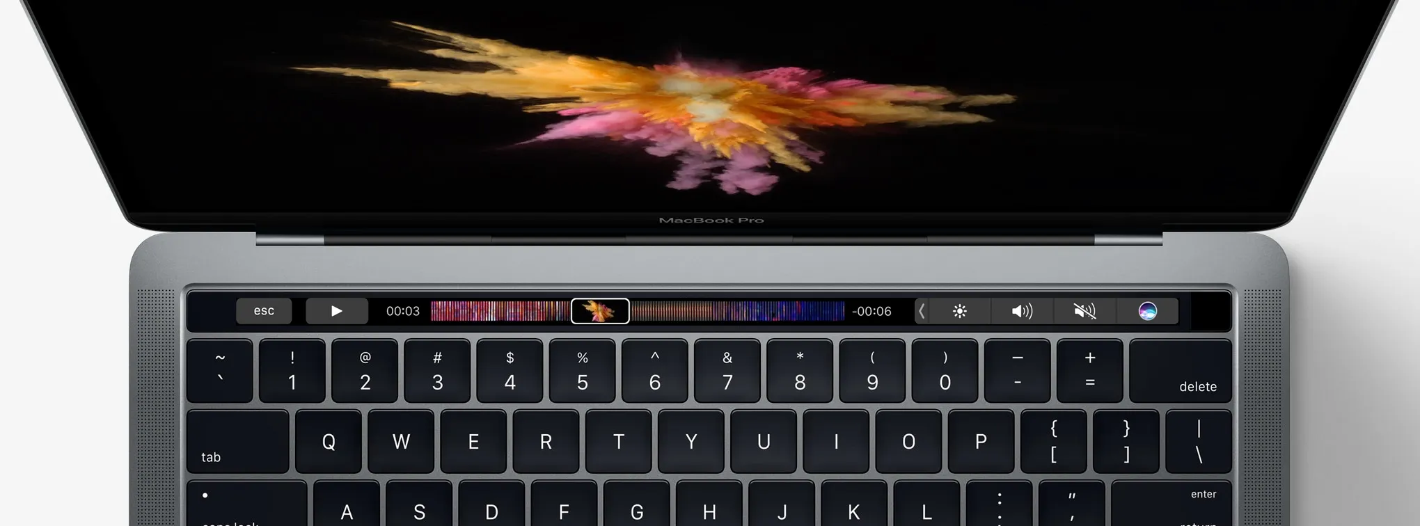
Thoughts on Touch Bar—the new multi-touch strip on the new line of MacBook Pros
For the past few days there have been numerous reports that the next iPhone would feature the newly developed Li-Fi, which is the transfer of data using visible spectrum of light instead of radio waves, which the Wi-Fi use. Li-Fi boasts a bandwidth 10,000 times that of Wi-Fi. The radio spectrum being extremely crowded, Li-Fi is well in need. Li-Fi works by modulating the intensity of light emitted by light sources such as LED lamps in a very indiscrenable way to humans to get the data across....